Today there are multiple devices with different dimensions. So, it is a fundamental responsibility of a web developer to make the website responsive for all possible devices. Though it is difficult to handle and position every element of the webpage in different dimensions. To overcome from this a powerful I mean life saver CSS property is used which is known as Media Query. This property helps the developer to define the position of elements in every dimension.
This property is usually defined after the main CSS as a good practice for web developers. It is denoted by @media(max-width/min-width:values)
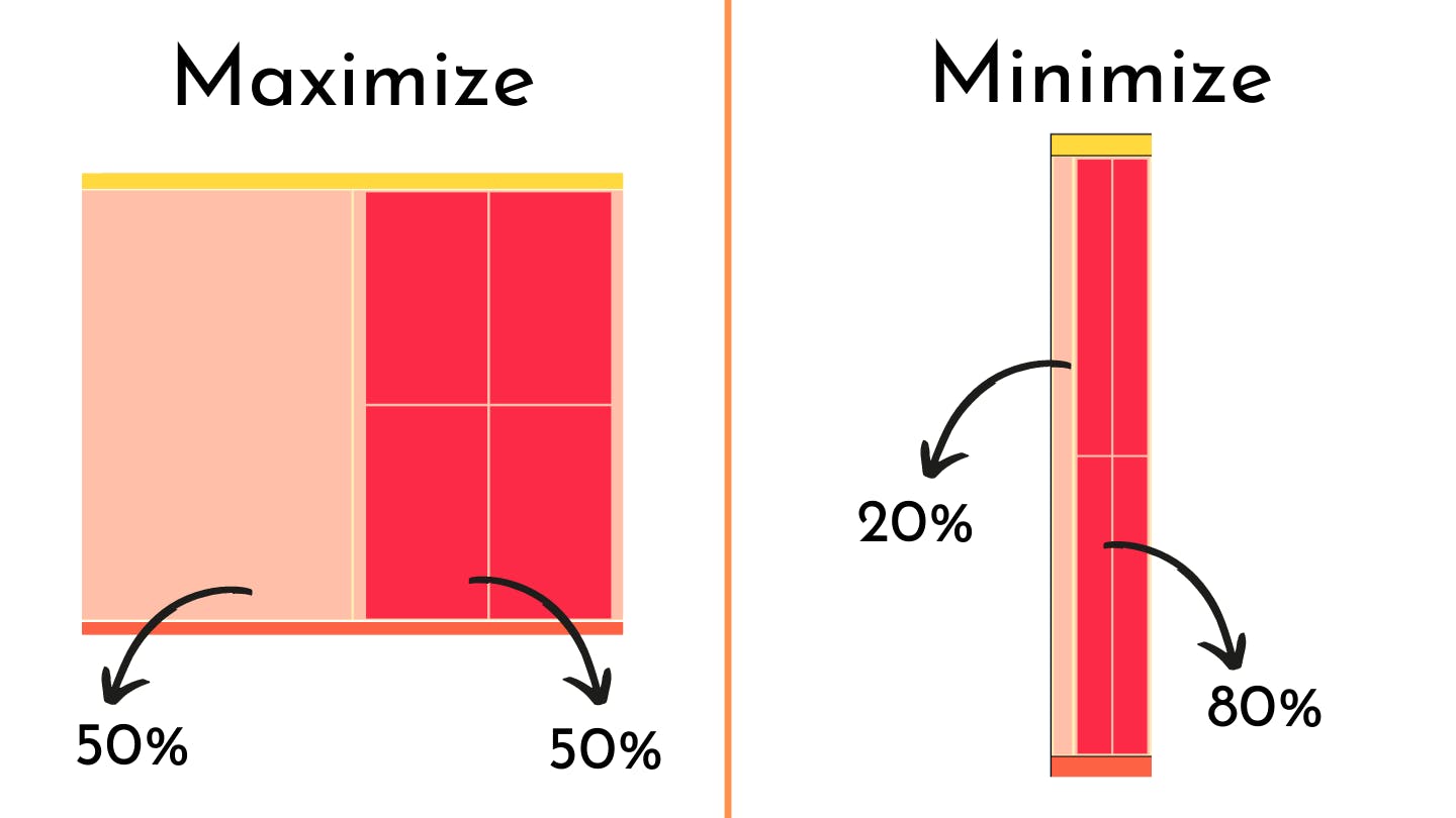
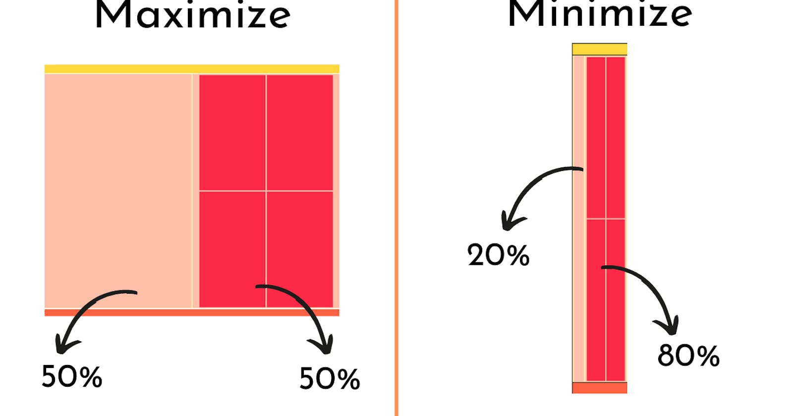
Through this, a web developer can easily change the properties of an element for max-width or min-width depending on the proper position of elements.
For more clarification, here is a simple use of media query.
<!DOCTYPE html>
<html>
    <head>
        <style>
            *{
                  margin:0;
                 padding:0;
            }
             body{

                 width:97%;
                 margin:0 auto;

             }
            header{

                height:70px;
                width:100%;
                background-color:#FFD93D;
                margin-top:5px;
            }
            main{
                min-height:400px;
                width:100%;
                margin-top:5px;
                background-color:#FFEBB4;
                display:flex;
            }
            footer{
                 height:70px;
                width:100%;
                background-color:#FE6244;
                margin-top:5px;
            }
            .left-div{
               min-height:50%;
                width:50%;
                margin:5px;
                background-color:#FFBFA9;

            }
              .right-div{

                  display:flex;
              justify-content:center;
                  flex-wrap:wrap;
                min-height:50%;
                width:50%;
                margin:5px;
                background-color:#FFBFA9;

            }
            .box-1{


                height:45vh;
                width:45%;
                margin:5px;
                background-color:#FC2947;

            }
              .box-2{

                height:45vh;
                width:45%;
                margin:5px;
                background-color:#FC2947;

            }
               .box-3{

                height:45vh;
                width:45%;
                margin:5px;
                background-color:#FC2947;

            }
             .box-4{

                height:45vh;
                width:45%;
                margin:5px;
                background-color:#FC2947;

            }
         @media (max-width:480px){
            body{
                background-color:black;
            }
            .left-div{
                width:20%;

            }
            .right-div{
                width:80%;

            }
        }


        </style>
        <title>Page Title</title>
    </head>
    <body>
        <header>

            </header>
            <main>
                <div  class="left-div"></div>
                <div  class="right-div">
                    <div class="box-1"></div>
                    <div class="box-2"></div>
                    <div class="box-3"></div>
                    <div class="box-4"></div>
                </div>
            </main>
            <footer></footer>

    </body>
</html>