

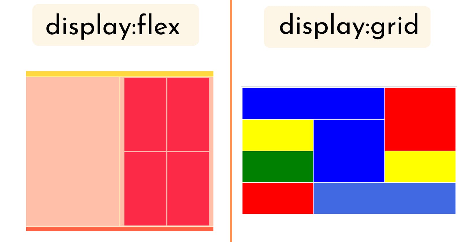
These two properties are the most common properties used in CSS, especially Flexbox. It has multiple functionalities to manipulate the parent container as well as child elements. Flexbox is good for one parent container whereas Grid is best for multiple parent containers. Though both are interrelated and work together mostly in every CSS sheet.
Flexbox: This CSS property provides the power to the web developer to move the parent container in 1D (left, right, top, bottom). We can even put the container exactly at the centre by using three magical lines i.e display:flex; align-items:center; justify-content:center; There is also another additional property to specify the position of an element such as top, start, end, and bottom. Note before using any flex properties it is important to mention "display:flex;"
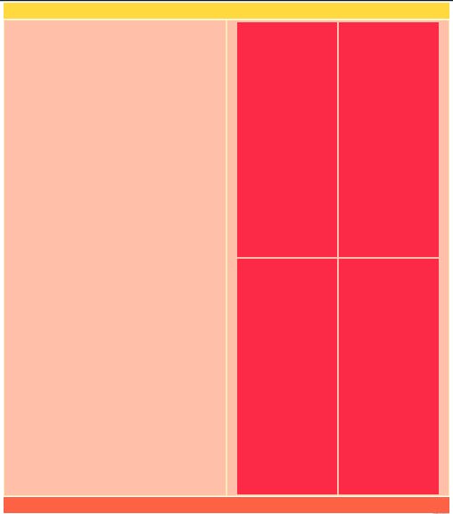
Here is an example that includes Flex property.
<!DOCTYPE html>
<html>
    <head>
        <style>
            *{
                  margin:0;
                 padding:0;
            }
             body{

                 width:97%;
                 margin:0 auto;

             }
            header{

                height:70px;
                width:100%;
                background-color:#FFD93D;
                margin-top:5px;
            }
            main{
                min-height:400px;
                width:100%;
                margin-top:5px;
                background-color:#FFEBB4;
                display:flex;
            }
            footer{
                 height:70px;
                width:100%;
                background-color:#FE6244;
                margin-top:5px;
            }
            .left-div{
               min-height:400px;
                width:50%;
                margin:5px;
                background-color:#FFBFA9;

            }
              .right-div{

                  display:flex;
              justify-content:center;
                  flex-wrap:wrap;
                min-height:400px;
                width:50%;
                margin:5px;
                background-color:#FFBFA9;

            }
            .box-1{


                height:45vh;
                width:45%;
                margin:5px;
                background-color:#FC2947;

            }
              .box-2{

                height:45vh;
                width:45%;
                margin:5px;
                background-color:#FC2947;

            }
               .box-3{

                height:45vh;
                width:45%;
                margin:5px;
                background-color:#FC2947;

            }
             .box-4{

                height:45vh;
                width:45%;
                margin:5px;
                background-color:#FC2947;

            }
         @media (max-width:480px){
            body{
                background-color:black;
            }
            .left-div{
                width:20%;

            }
            .right-div{
                width:80%;

            }
        }


        </style>
        <title>Page Title</title>
    </head>
    <body>
        <header>

            </header>
            <main>
                <div  class="left-div"></div>
                <div  class="right-div">
                    <div class="box-1"></div>
                    <div class="box-2"></div>
                    <div class="box-3"></div>
                    <div class="box-4"></div>
                </div>
            </main>
            <footer></footer>

    </body>
</html>
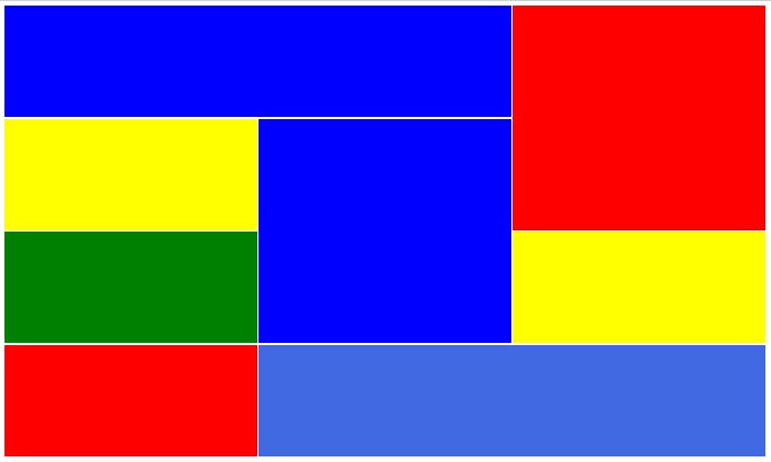
Grid: If there are multiple containers in columns and rows then Grid could be a lifesaver for Web developers. Imagine you already know the exact columns and rows required for the elements but the position of the elements changes in different dimensions then in that case Grid is the best option. Grid works in both 1D and 2D and elements can be positioned anywhere without using absolute properties. Not only this we can exchange the position of elements. There are multiple benefits, we can even create a whole web layout through Grid. Here also to use Grid we have to specify it by adding "display:grid".
Note It's important to know how to use these alternatives correctly in order to improve our work. Using them randomly without understanding their purpose can be ineffective.
Here's an example that demonstrates the use of Grid property.
<!DOCTYPE html>
<html>
    <head>
        <style>
            body{
                overflow:hidden;
            }
          .boxes{
              display:grid;
              grid-template-columns:1fr 1fr 1fr;;
              grid-template-rows:repeat(6, 200px);
              gap:3px;
          }
          .box1{
              background-color:blue;
               grid-column-start:1;
              grid-column-end:3;


          }
          .box2{
              background-color:yellow;
              grid-column-start:1;
              grid-column-end:2;

          }
          .box3{
              background-color:red;
                grid-column-start:3;
                grid-row-start:1;
              grid-row-end:3;


          }
           .box4{
              background-color:green;

          }
           .box5{
              background-color:blue;
              grid-column-start:2;
                grid-row-start:4;
              grid-row-end:2;
          }
           .box6{
              background-color:yellow;
          }
           .box7{

              background-color:red;
          }
           .box8{
              background-color:royalblue;
                grid-column-start:2;
              grid-column-end:4;
          }
        </style>
        <title>Page Title</title>
    </head>
    <body>
        <div class="boxes">
        <div class="box box1"></div>
        <div class="box box2"></div>
        <div class="box  box3"></div>
        <div class="box box4"></div>
          <div class="box box5"></div>
            <div class="box box6"></div>
              <div class="box box7"></div>
              <div class="box box8"></div>
        </div>

    </body>
</html>
While it's clear that these properties have specific uses, there is always more to research and learn in order to fully understand their capabilities and how to use them effectively.