

Sometimes we become more fascinates by such websites which are filled with more amusing animations. This animation automatically initializes without any user interrupts.
Hence the properties required for animation are as follows:
@keyframes: This specifies the time at which the animation will change such as
from{attributes}-to{attributes} and 0%-100%.animation-name: This helps to identify the element to which animation should be applied.
animation-duration: This specifies the time takes to complete whole animation such as
2s or 300ms. Here 's' refers to seconds.animation-delay: This specifies the time to start the animation when the page opens.
animation-iteration-count: It specifies how many times the animation should occur such as
1, 2, or infinite.animation-direction: This specifies the direction in which the animation plays, either
forwards or backwards or alternate.animation-timing-function: This specifies the speed of animation such as
ease( slow start -then fast-the slow end), ease-in(slow start), ease-out( slow end). linear(same speed in start and end).
Here is the following code of animation with Output:
<!DOCTYPE html>
<html>
    <head>
        <style>
            div{
                width:500px;
                height:90vh;
                border-radius:8px;
                border:2px solid black;
                background-image: url(https://img.freepik.com/premium-photo/field-green-grass-blue-sky-with-cloud-cloudy-landscape-background_36078-508.jpg?w=740);
            }
           .badminton{
               margin-top:20px;
                animation:badminton;
                animation-duration:4s;
                width:120px;
                 transform:rotate(90deg);
                animation-iteration-count:infinite;
                animation-direction:linear;
            }
            .Shuttlecock{
                position:relative;
                bottom:20px;
                animation-name:Shuttlecock;
                transform:rotate(-50deg);
                width:35px;
                margin-left:-20px;
                animation-duration:4s;
                animation-iteration-count:infinite;
                animation-direction:linear;

            }

            @keyframes badminton{
                0%{
                    transform:rotate(90deg);
                     }
                     100%{
                         transform:rotate(40deg);
                     }
            }
            @keyframes Shuttlecock{
                0%{
                    top:0px;
                   left:0px;

                     }
                     33.3%{
                        top:100px;
                    left:350px;
                     }
                     66.6%{
                         top:200px;
                   left:-100px;
                     }
                      99.9%{
                         top:350px;
                   left:350px;
                     }
            }
            </style>

        <title>Page Title</title>
    </head>
    <body>
        <div>
           <img class="badminton"src="https://cdn-icons-png.flaticon.com/512/1222/1222751.png"/>
           <img class="Shuttlecock" src="https://cdn-icons-png.flaticon.com/512/1189/1189239.png?w=740&t=st=1681145394~exp=1681145994~hmac=c0472df4173ff365d7046b4360edfba337d4d01b25a21ef18404d489f8cdf232"/>


            </div>

    </body>
</html>
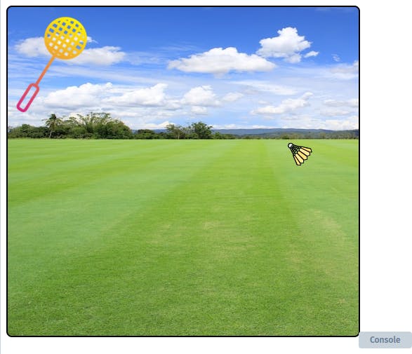
For a better output experience, I suggest trying it on your ID and running it in a local browser.